Skip to content

Nick Garrett

  • CONTACT
  • BIOGRAPHY
  • MURALS
  • GALLERY
    • WALPOLE BAY
    • THEY CAME DOWN FROM ABOVE
    • THEY CAME DOWN FROM ABOVE II
    • BATTERSEA POWER STATION
    • PORTRAIT

Category: logo

Posted on February 17, 2012

FONTS – Franklin Gothic

Nick Garrett Margate & London Traditional Signwriting & Glass Gilding

The London Sign Writer Nick Garrett

Long over shadowed by Gill sans and Helvetica, Franklin Gothic is now making a comeback.

Its slightly grave graphic profile and retro appeal is now creating a cool option for type setters, designers and creatives.
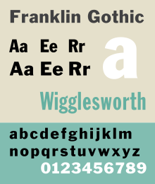
FranklinGothicSP.svg

Artwork for NGS layout in Franklin...
History

Franklin Gothic and its related faces are realist sans-serif typefaces originated by Morris Fuller Benton (1872–1948) in 1902. “Gothic” is an increasingly archaic term meaning sans-serif. Franklin Gothic has been used in many advertisements and headlines in newspapers. The typeface continues to maintain a high profile, appearing in a variety of media from books to billboards. Despite a period of eclipse in the 1930s, after the introduction of such European faces as Kabel and Futura, they were re-discovered by American designers in the 1940s and have remained popular ever since.


In 1979, under license with ATF, Vic Caruso began work on more weights of the…

View original post 542 more words

Posted on February 17, 2012

Fonts: Frank Pick

Nick Garrett Margate & London Traditional Signwriting & Glass Gilding


back
Frank Pick</p><br />
<p>

Frank Pick

The North Downs, 1916<br /><br />
Advertising poster<br /><br />
Design: E. McKnight Kauffer<br /><br />
© TfL/London's Transport Museum</p><br />
<p>

The North Downs, 1916
Advertising poster
Design: E. McKnight Kauffer
© TfL/London’s Transport Museum

Reigate, 1916<br /><br />
Advertising poster<br /><br />
Design: E. McKnight Kauffer<br /><br />
© TfL/London's Transport Museum</p><br />
<p>

Reigate, 1916
Advertising poster
Design: E. McKnight Kauffer
© TfL/London’s Transport Museum

Original drawing for the London Underground roundel symbol<br /><br />
Design: Edward Johnston<br /><br />
© TfL/London's Transport Museum</p><br />
<p>

Original drawing for the London Underground roundel symbol
Design: Edward Johnston
© TfL/London’s Transport Museum

Harry Beck in 1965, holding one of his 1931 sketches of the diagrammatic London Underground map<br /><br />
© TfL/London's Transport Museum</p><br />
<p>

Harry Beck in 1965, holding one of his 1931 sketches of the diagrammatic London Underground map
© TfL/London’s Transport Museum

Thanks to the Underground, 1935<br /><br />
Advertising poster<br /><br />
Design: Zero (Hans Schleger)<br /><br />
© TfL/London's Transport Museum</p><br />
<p>

Thanks to the Underground, 1935
Advertising poster
Design: Zero (Hans Schleger)
© TfL/London’s Transport Museum

Come out to Live, Come in to Play, 1936<br /><br />
Advertising poster<br /><br />
Design: Paul Nash<br /><br />
© TfL/London's Transport Museum</p><br />
<p>

Come out to Live, Come in to Play, 1936
Advertising poster
Design: Paul Nash
© TfL/London’s Transport Museum

Your Fare from This Station, 1936<br /><br />
Advertising poster<br /><br />
Design: Laszlo Moholy-Nagy<br /><br />
© TfL/London's Transport Museum</p><br />
<p>

Your Fare from This Station, 1936
Advertising poster
Design: Laszlo Moholy-Nagy
© TfL/London’s Transport Museum

Go out into the Country, 1938<br /><br />
Advertising poster<br /><br />
Design: Graham Sutherland<br /><br />
© TfL/London's Transport Museum</p><br />
<p>

Go out into the Country, 1938
Advertising poster
Design: Graham Sutherland
© TfL/London’s Transport Museum

Original Diamond Diagonal - Chevron,  c.1938<br /><br />
Design: Enid Marx<br /><br />
Upholstery fabric<br /><br />
© TfL/London's Transport Museum</p><br />
<p>

Original Diamond Diagonal – Chevron, c.1938
Design: Enid Marx
Upholstery fabric
© TfL/London’s Transport Museum

Arnos Grove station booking hall after its construction in 1932<br /><br />
© TfL/London's Transport Museum</p><br />
<p>

Arnos Grove station booking hall after its construction in…

View original post 2,526 more words

Posts navigation

Page 1 Page 2 Next page

SEARCH HERE

Top Posts & Pages

  • Lucian Freud - a very peculiar dad
  • The best Sign Writing course
Blog at WordPress.com.
  • Follow Following
    • Nick Garrett
    • Already have a WordPress.com account? Log in now.
    • Nick Garrett
    • Customize
    • Follow Following
    • Sign up
    • Log in
    • Report this content
    • View site in Reader
    • Manage subscriptions
    • Collapse this bar
 

Loading Comments...